Portfolio
TONIES


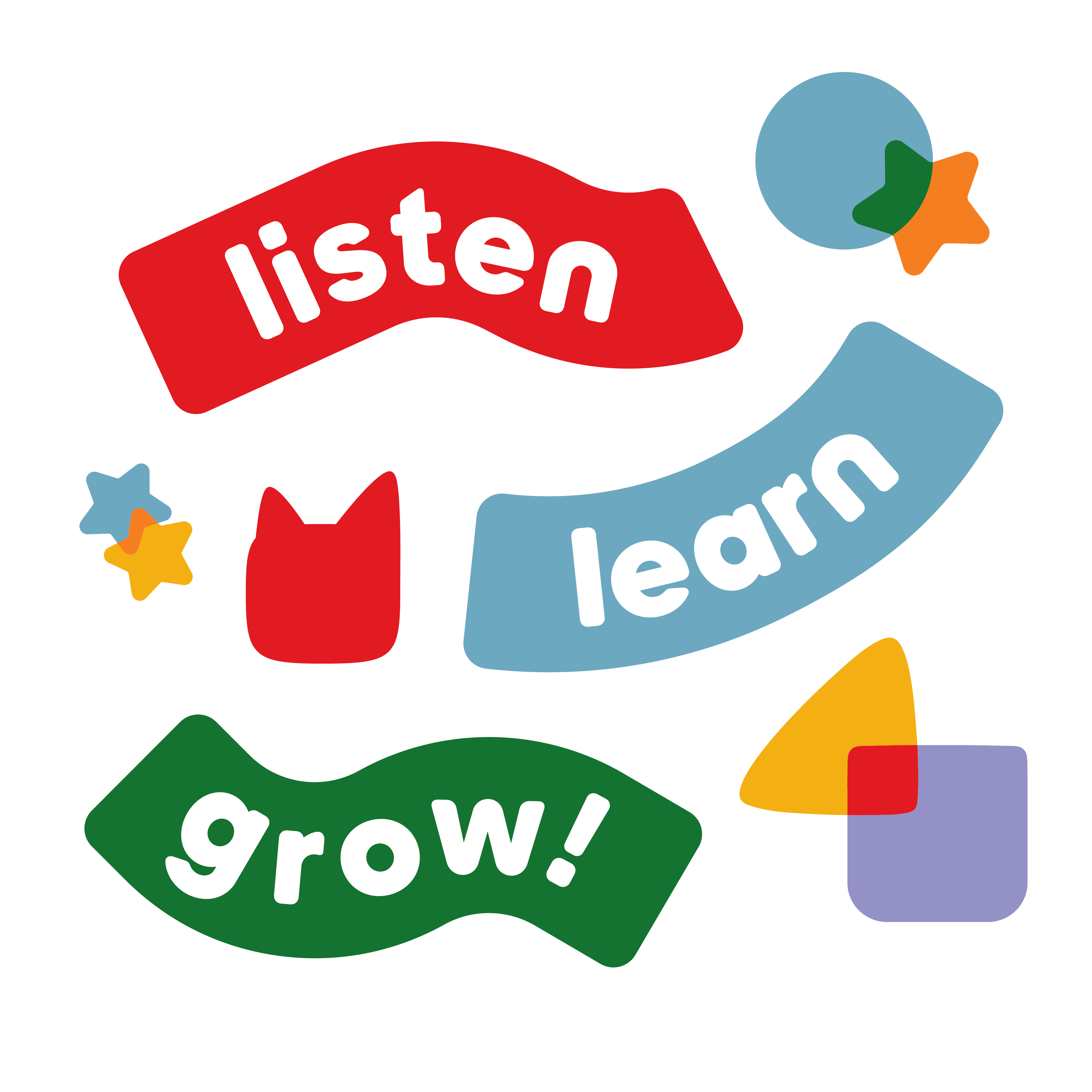
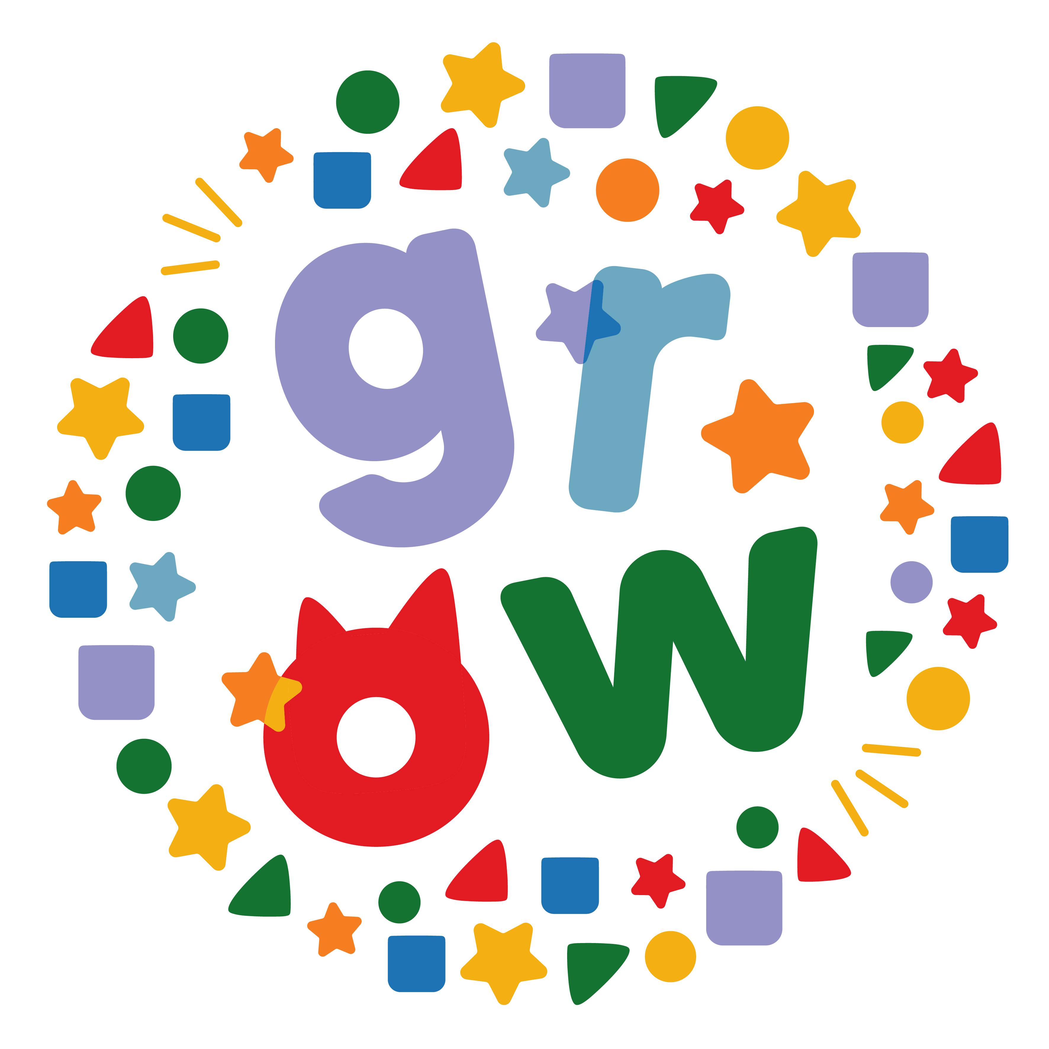
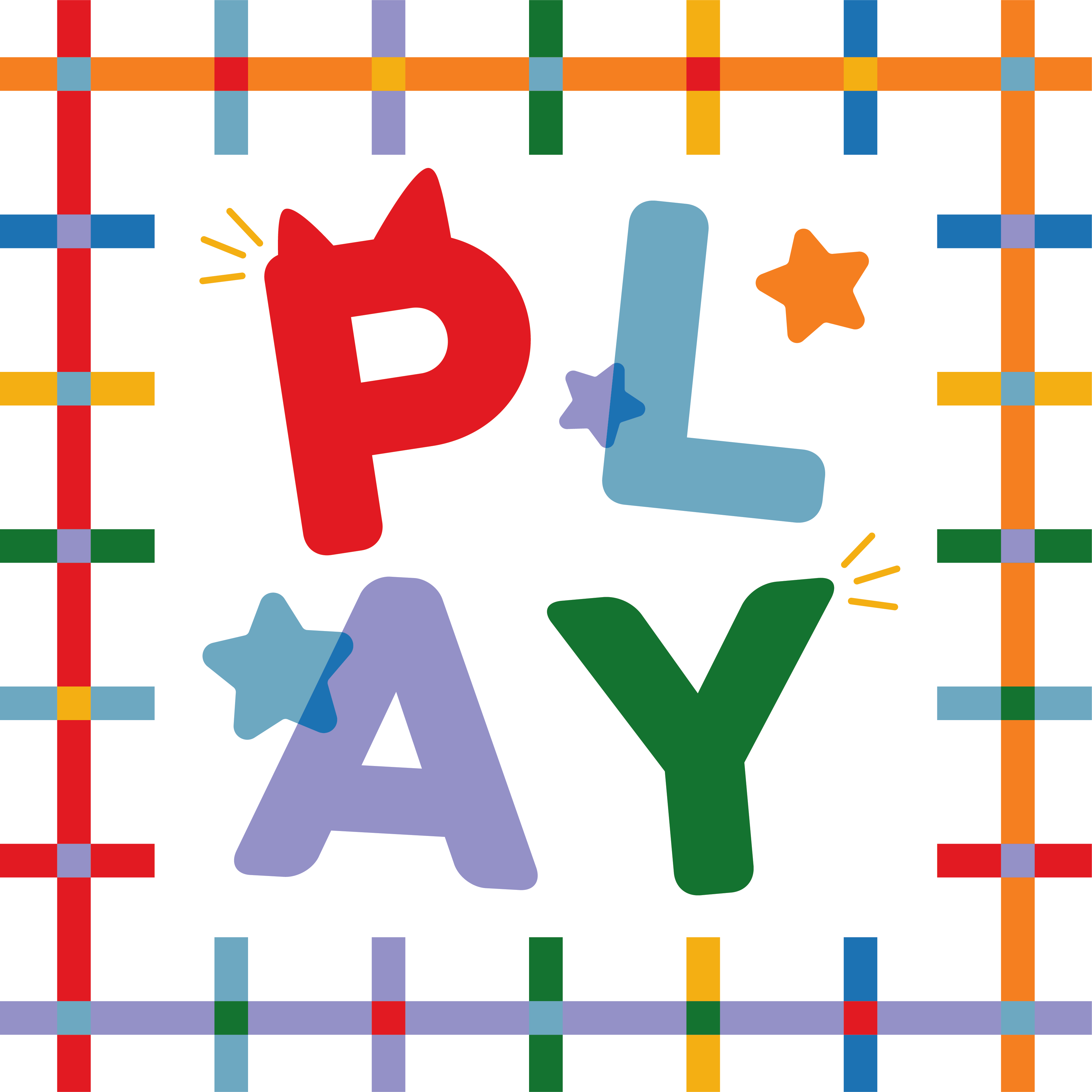
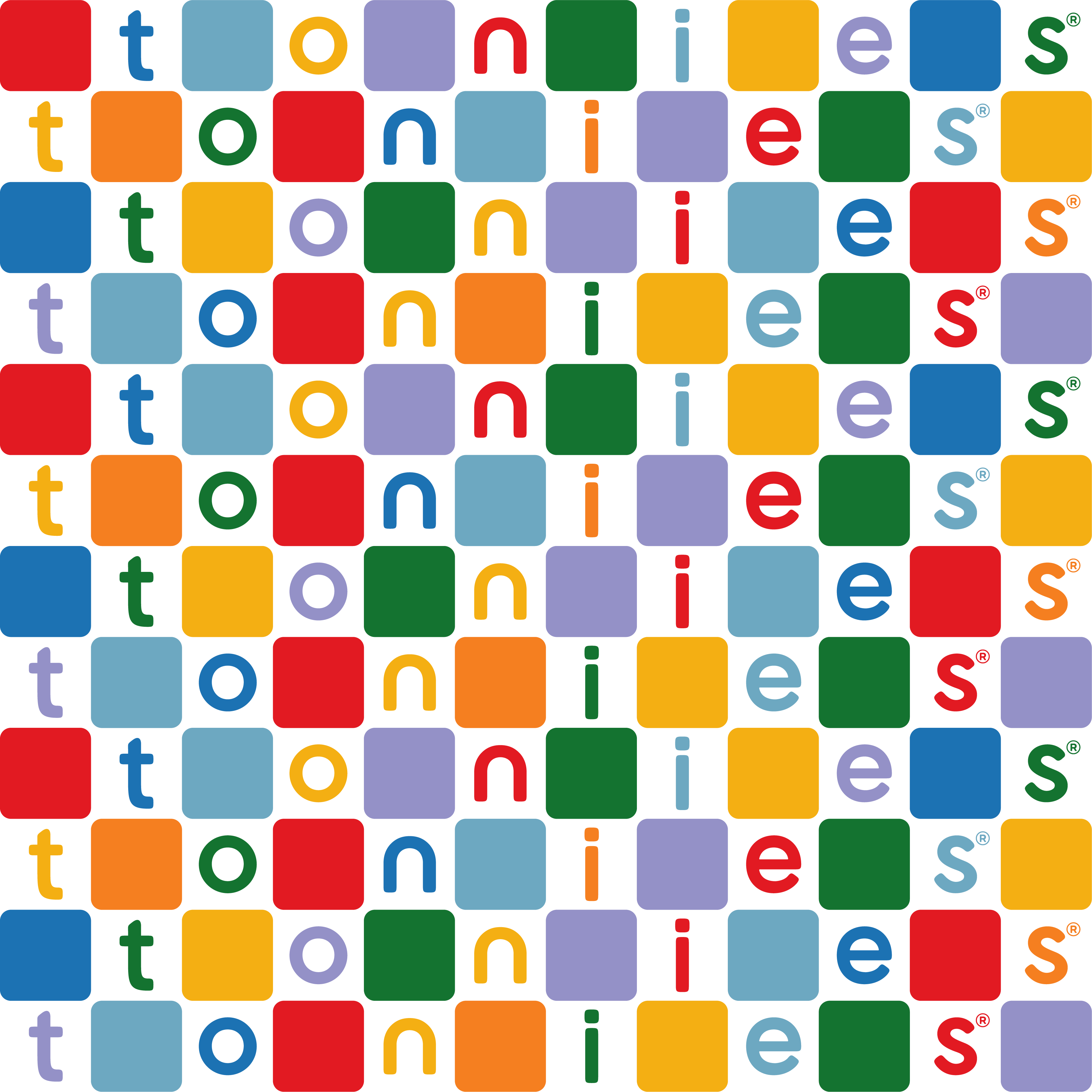
I was incredibly grateful that Sophie (SBC) asked me to help create designs for tonies, as it's such an exciting and innovative brand. At its core, tonies is all about inspiring children's imagination and making learning fun through ears first storytelling and play, which became a key consideration when developing creative assets for the brand. As it wasn't a traditional character-led approach, we had to think outside the box (quite literally!), and explore ways of translating the brand's personality into visuals.
For our first project, we focused on bold simplicity, using strong block colours, clear shapes and confident typography to create standout brand moments. From there, I helped develop compositions and patterns that felt true to both the creative direction and the brand itself. By combining phrases that felt authentic to the brand with their signature cat-ear shape, we created designs that felt playful and stimulating. The use of overlapping graphics and typography helped introduce a sense of curiosity, energy and movement.
Project included:
-
Creating patterns and compositions
-
Designing with overlapping and interacting elements to create a sense of energy